Drupal to a custom WordPress build. More than 5,000 content records and 4,865 media files migrated, five school sections given their own identity, and 117 programs restructured so a student can filter by degree, format, and area of study.
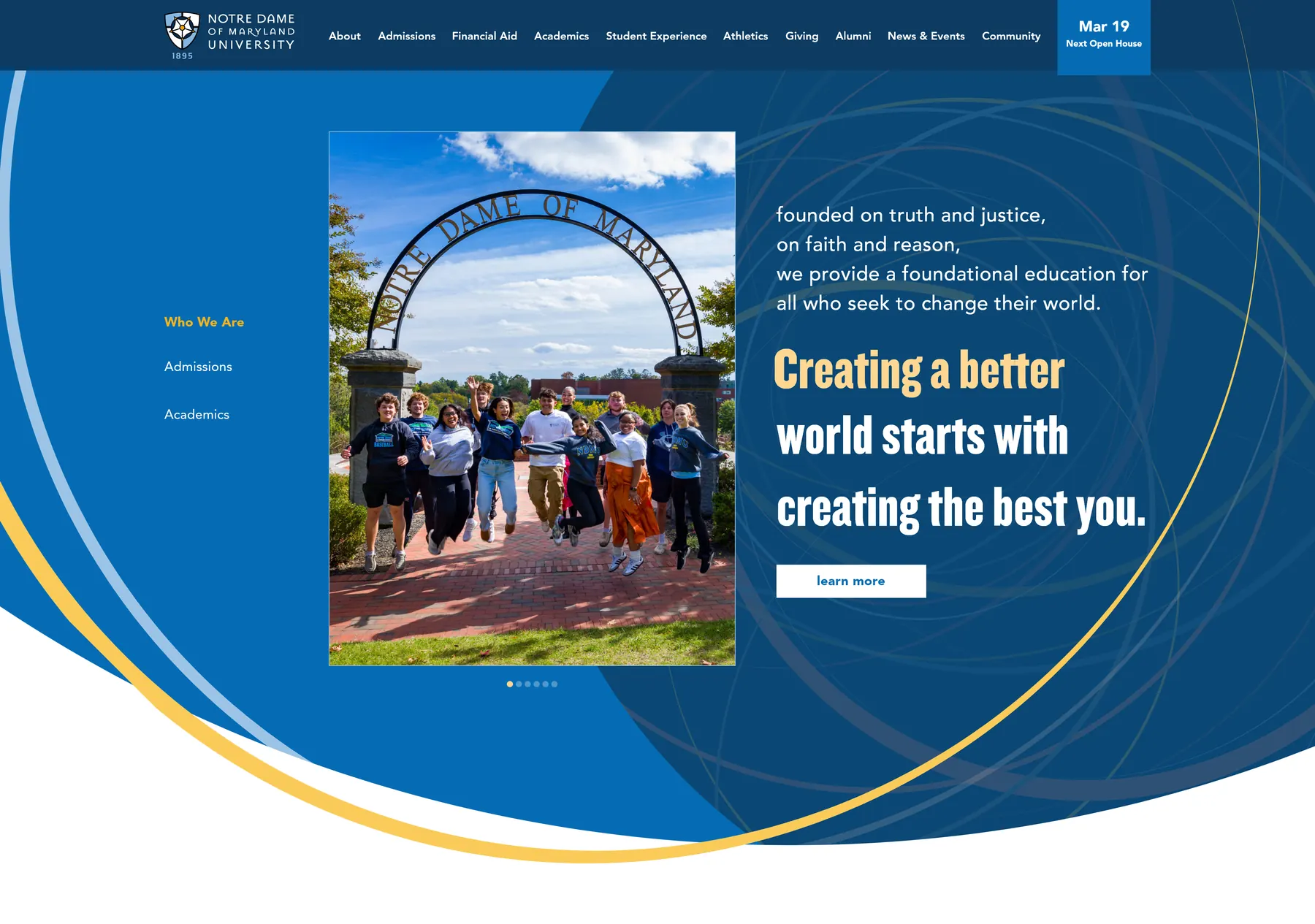
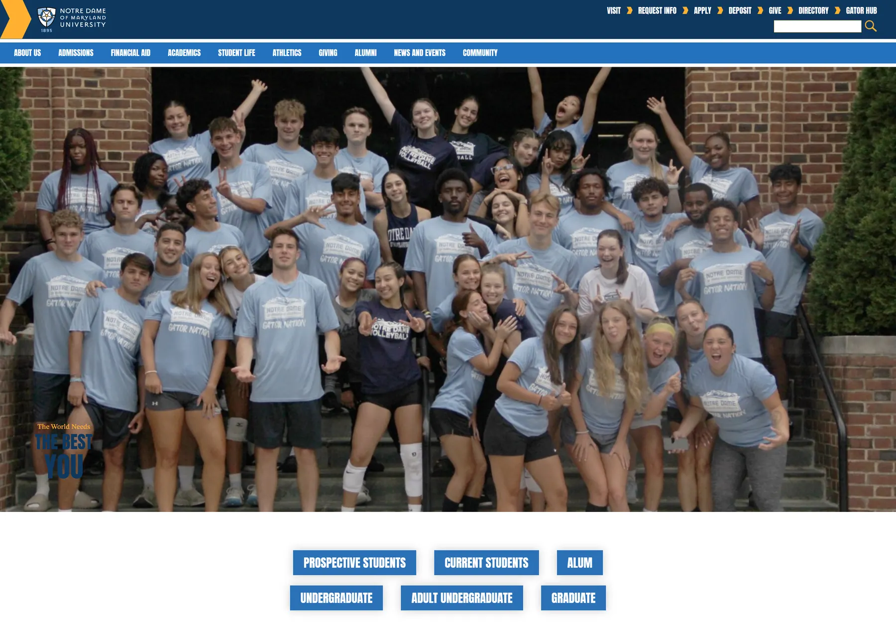
The first design review set the bar: interesting, not safe, and interaction that rewards scrolling rather than decorating it. The home page is where that got settled.
Before · Drupal
After · July 10, 2026
We pitched in person to the president and the department and school heads together. A university rebuild touches every school’s territory, and having the people who own those territories in the room from the first day is what carries a project through month four. We kicked off in August.
Design ran September through March, which is longer than most firms would admit to and the reason the build went the way it did. More than a dozen page-level templates: home, admissions, academics, programs, schools, giving, financial aid, student life, community, alumni, news, directory, events.
The brief that shaped everything came out of the first review, and it was not a gentle one. Interesting, not safe. Movement. Interaction that rewards scrolling rather than merely decorating it. We had GSAP prototypes ready, which turned an abstract argument about ambition into something they could watch.
In Drupal, everything that distinguished one program from another lived in a single free-text field. That meant a prospective student could not filter by degree, format, or area of study.
We designed seven taxonomies for the 117 programs: level, degree, credential, division, area of study with nineteen terms, format, and location. Then we mapped that one Drupal field across all five core taxonomies, program by program.
The payoff is on the front end. A prospective student can now say what they are looking for and see only that.
We consolidated the catalog into five clean schools, then worked with the university’s marketing team to bring program content up to date. They carried our questions out to the schools and brought the answers back.
The structure was built to outlast that conversation. Because the taxonomy carries the meaning rather than the page, a program can be corrected at any point without anyone opening a template or calling us.
What that buys is an archive a visitor can filter and a catalog the university can keep accurate on its own timetable. The structure is the deliverable.
We migrated deliberately rather than with a bulk importer, because a bulk importer reproduces whatever structure it finds.
So we built our own. Unifying content types that had never shared a structure took custom migration tooling written for this project, and more than 40 ACF field groups that the university’s team now uses to run the site.
645 news posts, 172 student stories, 165 publications and 70 departments came across into a new tagging architecture that lets the communications team filter its own archive. Publications moved onto proper permalinks, grouped into three families. Events came across as one unified, working calendar.
The 405 directory profiles started with the university’s own records. Where those were incomplete we backfilled and scraped to close the gaps, then cleaned and hand verified every entry before reuploading them across the content types that needed them.
Media was its own project. Without full access to the original file server we scraped the live site, backfilled and sideloaded thousands of files, and deduplicated the result.
Phones are where prospective students actually browse, and a university site is a place people leave and come back to. So the off-canvas menu is not a shrunk-down desktop nav. It carries search, quick links, the next event, cascading section navigation, a utility strip and contact details, and underneath all of that, Recently Viewed.
Every page you open on that device is remembered locally and offered back to you the next time you open the menu. Nothing is sent anywhere and nothing is tied to an account. It is per-device and private.
It exists because of how people really shop for a degree: four programs open across two evenings, then a scramble to find the one that looked right. The menu just hands it back.
Each school carries its own color, and rather than hand-styling five variants we drove it from per-school CSS variables. A school’s color flows automatically into photo borders, badges, and a reading progress bar that tracks down the side of its pages.
The university came to us with a brand. We worked inside the existing identity and extended it for the web: the arcs and swooshes running through the site are ours, drawn for this build so the brand had a behavior in layout and motion and not only a logo and a palette.
The form has a reason. The arcs read as meridian lines, a nod to how Notre Dame of Maryland positions itself: globally minded, down to a named institute for global leadership. Threaded through the templates, they are now part of how the institution reads online.
One rule, applied everywhere, so a school page reads as part of the university and as itself at the same time.
We built the launch around the people using the site. Audiences knew the change was coming before it arrived, and had a simple way to flag anything that looked wrong on the day.
The DNS groundwork we did with the university’s IT team meant the new site was resolving everywhere within fourteen minutes of the switch. We cut over with approval to ship as built, and the day stayed quiet.
The site launched on Friday, July 10, 2026. Internally the response has been uniformly positive, which for a project that touched every school on campus is the result that matters most.
What changed is not only that the site is faster to maintain and cheaper to run. It is that the institution now has a site shaped around the person it is trying to reach, and an editorial system its own team can operate without calling us.
Every Drupal content type reviewed and given a migrate or retire decision.
Mapped across five schools and seven new taxonomies.
Into a new tagging architecture the communications team can filter.
Ported and given the same filtering as the rest of the archive.
Restructured into three families on proper permalinks.
Supplied by the university, then backfilled, cleaned and hand verified before being reuploaded across several content types.
The editorial system the university’s own team runs the site with.
The new site resolving everywhere, on a cutover planned with their IT team.
Signed and underway. Eleven months from here to launch.
Mood boards, then more than a dozen page-level templates worked through with the university's editorial owners.
The arc and swoosh system we created for the site applied across the template set, presented to the president and approved to build.
Theme build, then a six-week sprint. Content migrated record by record alongside their team.
Cutover with an audience communication plan. Full DNS propagation in fourteen minutes.
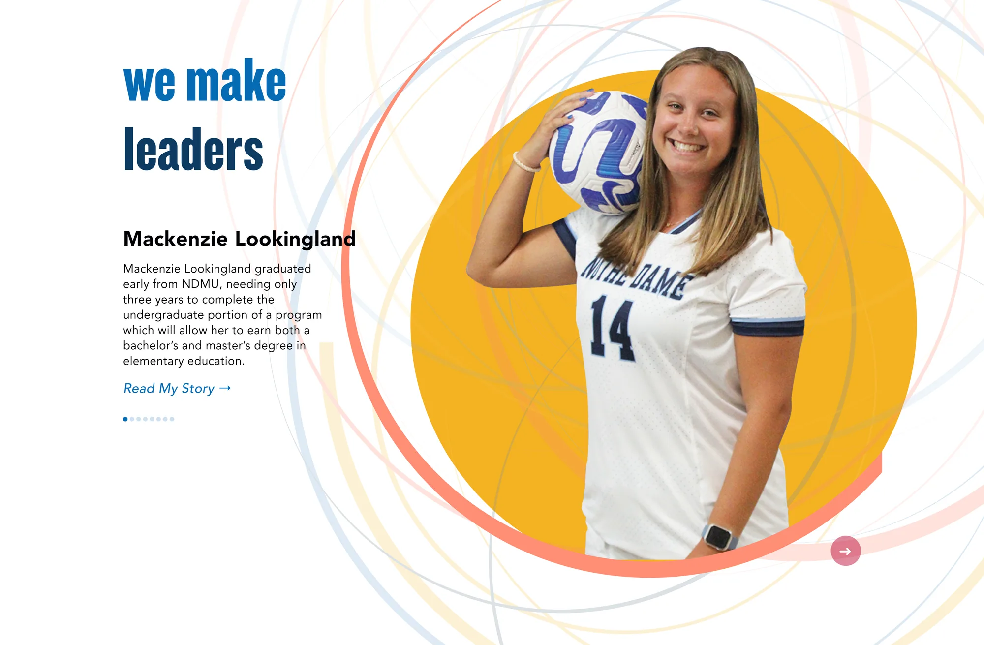
Student stories set in a circular crop, ringed by concentric arcs drawn from the university’s own identity. It carries a name, a story, and a way in, and it rotates through real students rather than stock.
Small components like this are where a template stops feeling like a template.
Thirty-minute intro call with Mark. No slide deck, no pitch.
Book an intro call →